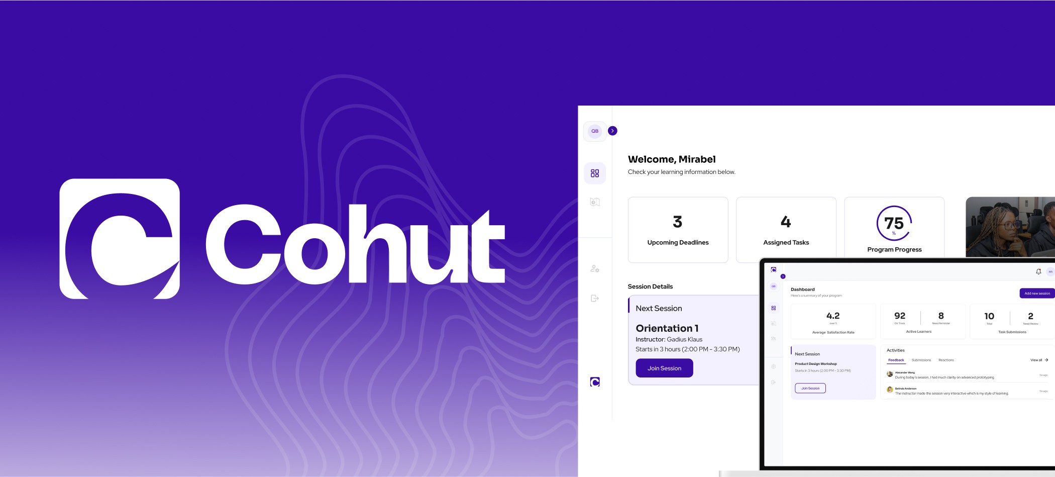
🎓 Overview
Cohut is a SaaS platform designed to help educators and operators of cohort-based programs manage their sessions with ease. With a focus on session-centric workflows, it offers creators an intuitive way to run learning experiences, and gives learners clarity and structure for engagement and progress.
👨💻 My Role
Product Designer
Led design system creation efforts
Designed key screens for both Creator and Learner dashboards
Implemented advanced Figma prototyping
Supported developer handoff and iteration
📅 Project Scope
Client Project
3-Month Timeline
Cross-functional team: 4 Designers, 6 Developers, 1 Product Manager
🔍 The Problem
Cohort-based learning is growing rapidly — with 90% completion rates far exceeding traditional online courses. But existing tools are either:
Bloated: Expensive “all-in-one” platforms with too many features, or
Fragmented: A messy DIY stack using tools like Zoom, Slack, Docs, and Calendly.
Cohut’s mission: Provide a focused platform that simplifies cohort-based program management while delivering an excellent user experience for both creators and learners.
🧭 Process
Research & Discovery
We viewed competitors like Teachable and Circle.
Leveraged our own experience using platforms like Coursera & Udemy.
Product direction was shaped by a PRD from the client-side Product Manager.
We maintained frequent feedback loops via weekly team syncs.
Ideation & Flow Structuring
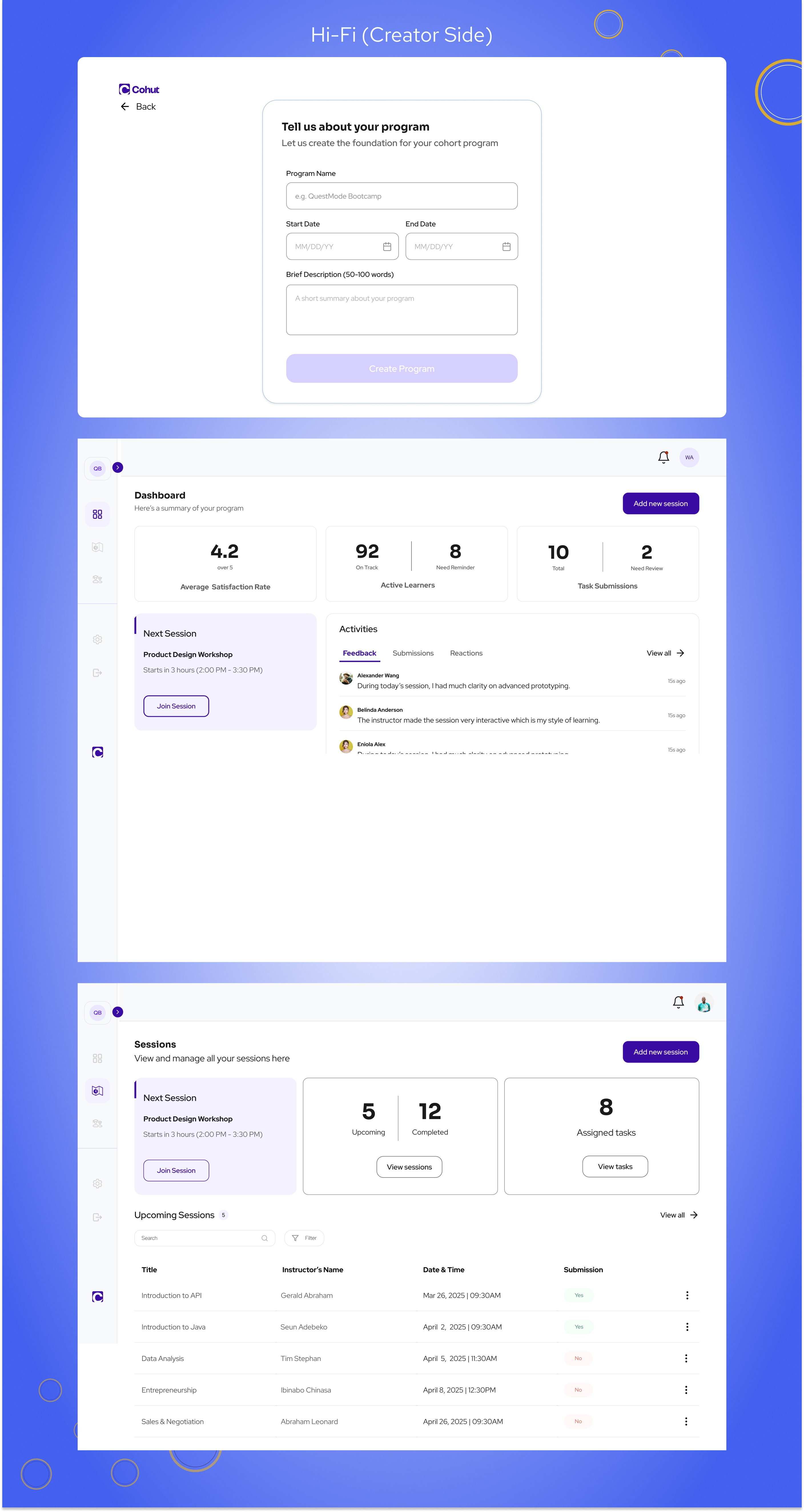
For Creators: The flow prioritized quick onboarding → session creation → learner invite → session tracking.
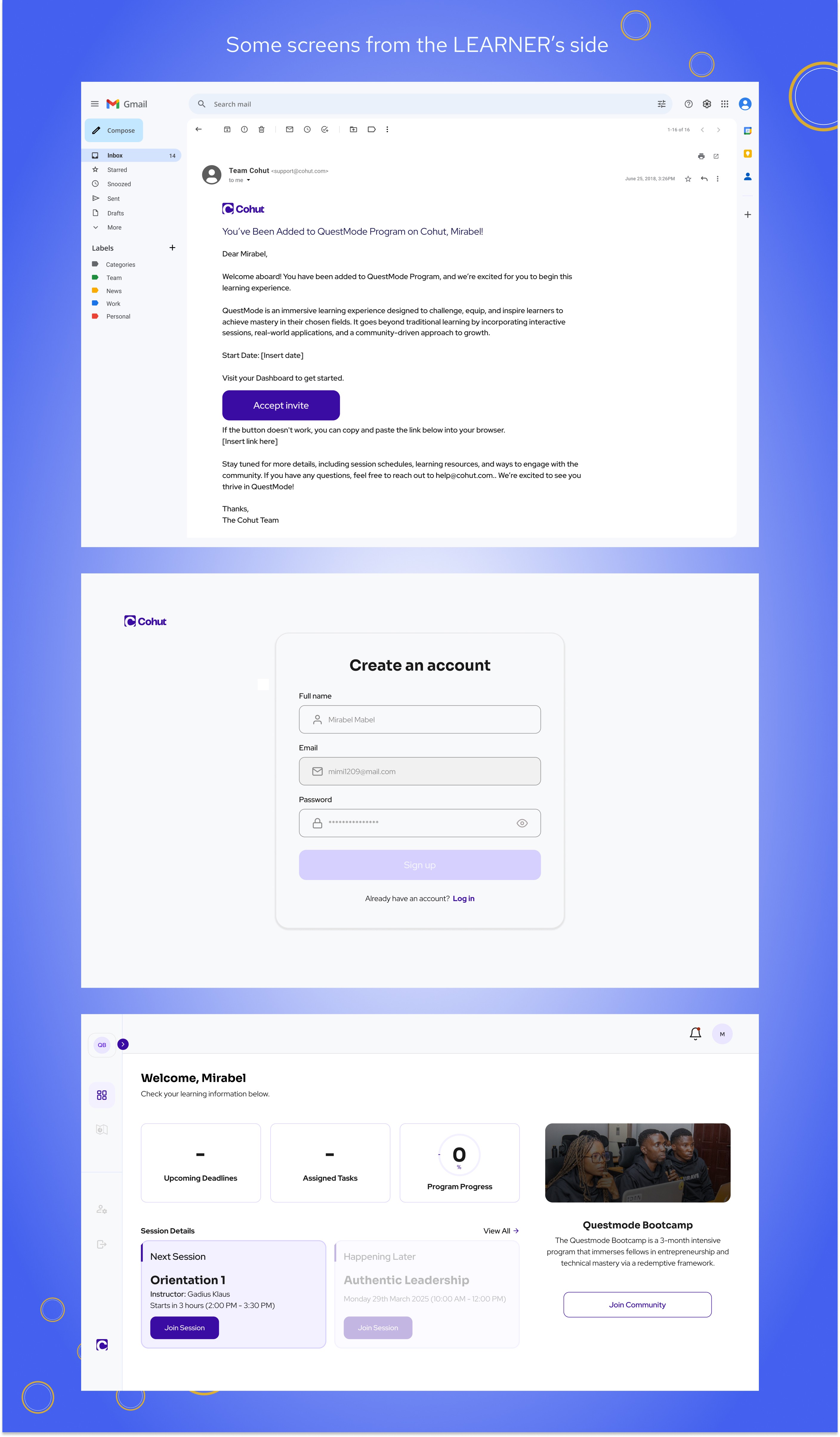
For Learners: Access was via email invite only, ensuring exclusivity. Dashboard prioritized upcoming deadline, tasks and program progress.
Design Philosophy Shift
We evolved from an early principle of “invisible complexity” to embrace radical simplicity, prioritizing clarity, utility, and easy cognition.
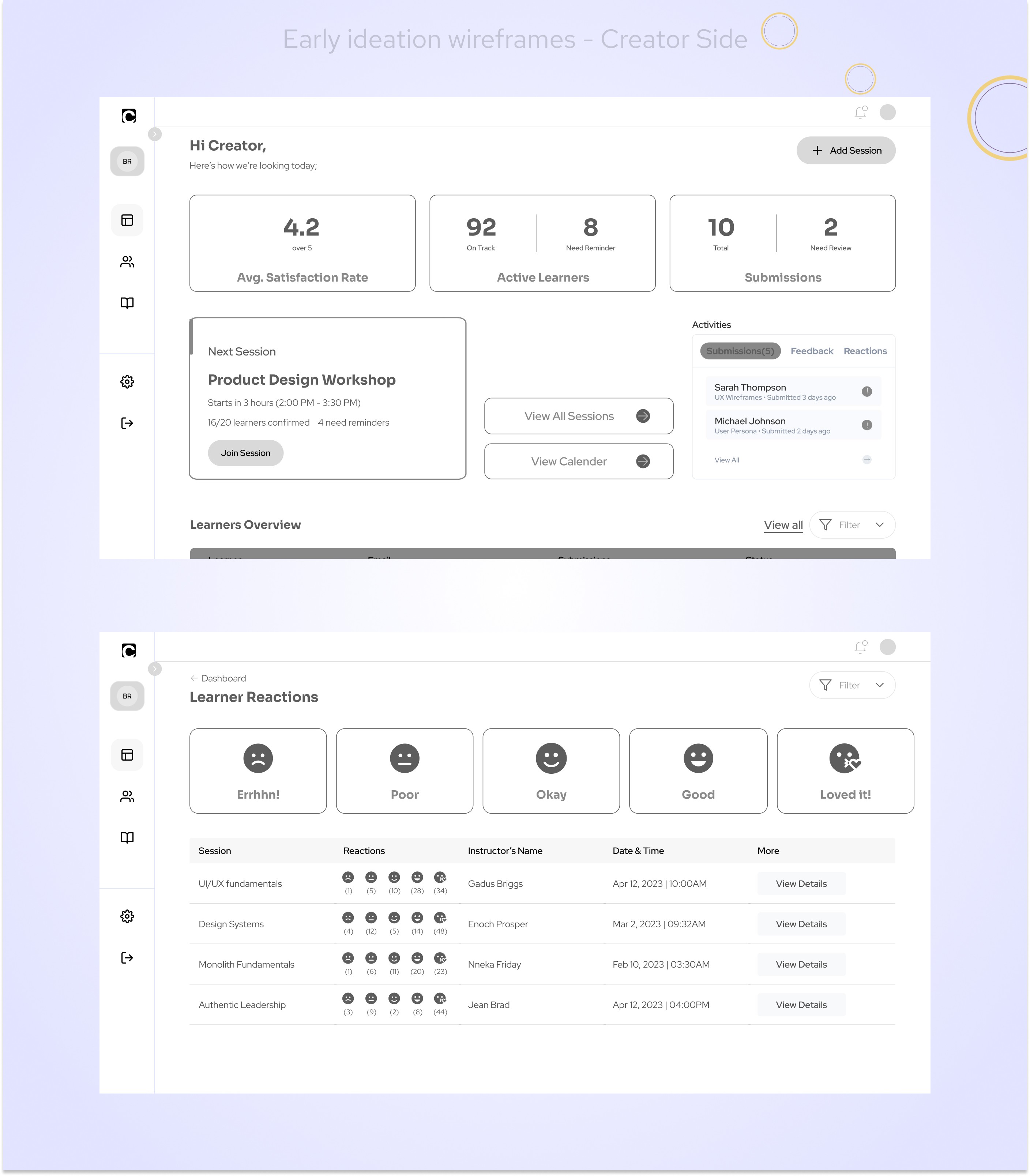
✏️Ideation & Wireframes
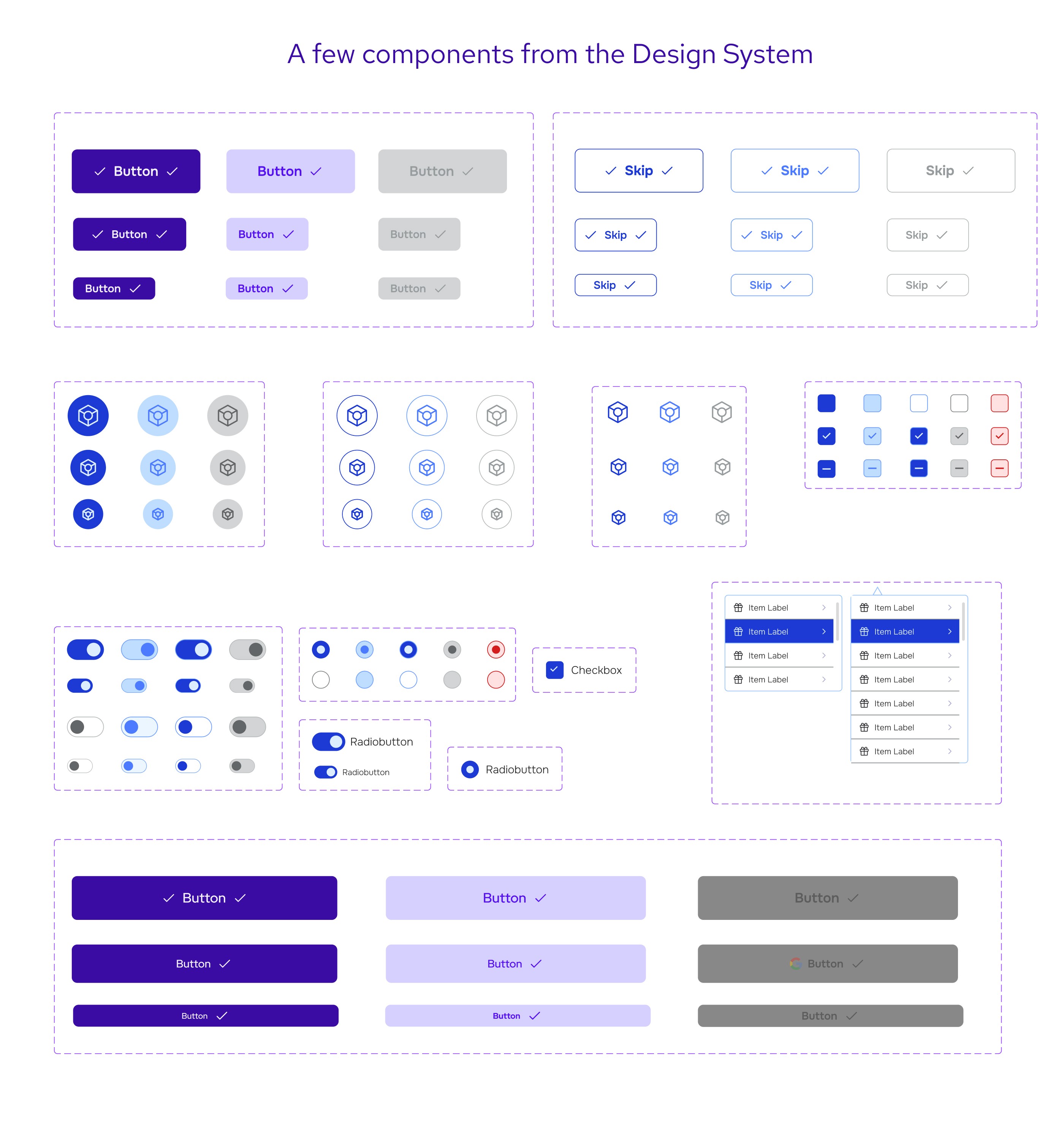
Design System & Visual Language
Typography: Headers – Sora, Body – Red Hat Display
Colors:
Primary:
#3A0CA3Accent:
#4361EESemantic:
Success –
#0FA36BWarning –
#E9A800Error –
#D90429
Base:
#1A1A1A(Black),#FFFFFF(White)
Developed and implemented core UI components and layout grids across both dashboards.
Accessibility
After a design audit, we discovered an opportunity to improve tag visibility and overall contrast.
Used Figma’s accessibility tools and applied WCAG principles to elevate inclusiveness.
Key Features Designed (As A Team)
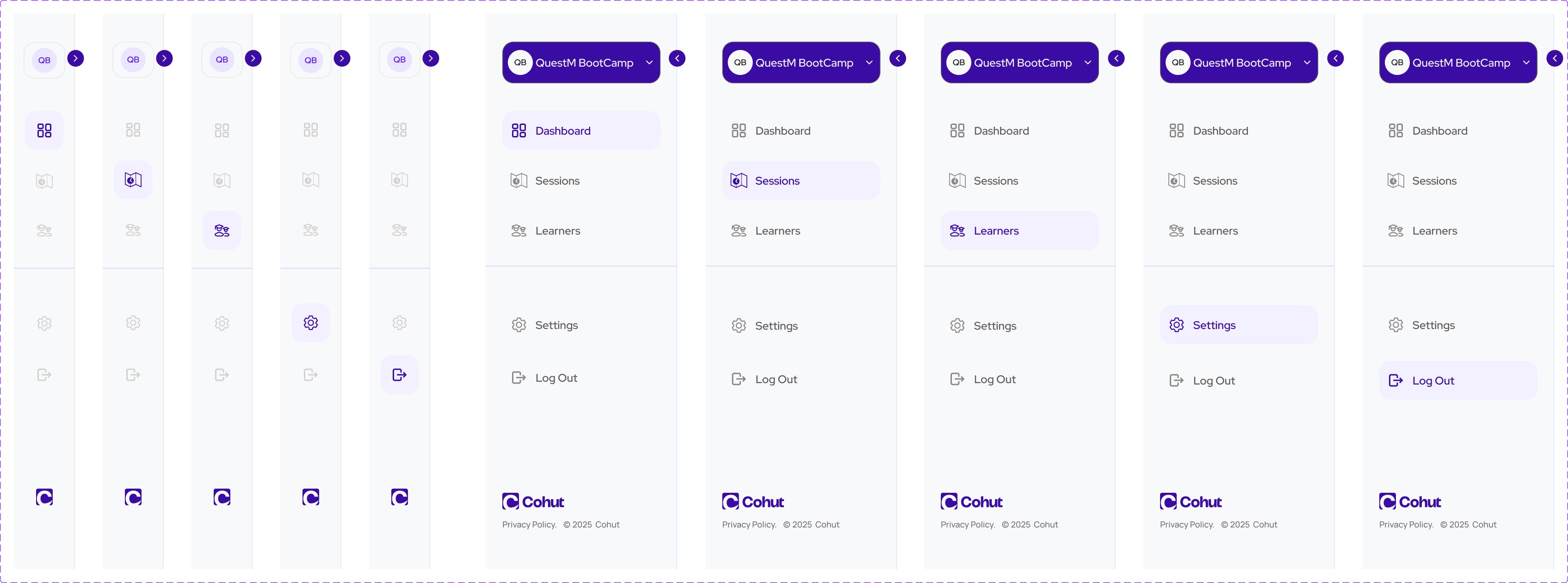
Dual Dashboards (Creator & Learner)
Session Creation Flow
Learner Invitation & Import via CSV
Expanded Session Page (includes learner reactions & feedback)
Design system with modular components
Feedback mechanisms and system notifications
⚙️ Handoff & Delivery
We followed an agile handoff process — delivering screens as they were completed, for implementation. However, design moved faster than dev. I remained embedded with the dev team post-handoff to provide design support, review feasibility, and update screens where necessary.
📈 Impact & Lessons Learned
What Worked
Weekly syncs ensured alignment, timely feedback, and clarity on shifting requirements.
A design audit mid-project allowed us to address accessibility early.
Structured flow design improved user focus and reduced cognitive load.
What I’d Do Differently
Align with engineers earlier to understand technical constraints and avoid rework.
Take more time upfront to understand business problems deeply.
Keep a pulse on evolving design philosophy and anchor decisions to it sooner.
Personal Growth
This project reinforced the value of patience, collaboration, and asking the right questions.
It helped me mature from screen-level design to problem-solving aligned with business and user goals.