👤 My Role
As the Product Designer, I led the end-to-end design of the product, from wireframes to prototype. I collaborated with a senior designer who contributed the logo and helped shape early visual direction, while I executed the design system, user flow, and interface design.
🧭Context & Problem
URL shorteners like Bit.ly exist, but many feel clunky, ad-heavy, or bloated with features. We wanted to create something that:
Embodies simplicity in both form and function
Allows users to track performance without feeling overwhelmed
Has a modern, inviting interface
🔍Research & Insight
We briefly studied platforms like Bitly and Google's now-retired URL shortener to understand:
Common patterns in shortening and tracking flows
Gaps in dashboard clarity or visual hierarchy
Opportunities to make link management more intuitive
🎯Design Goals
Stay true to the name Simple — minimal friction, clear hierarchy.
Build a dashboard that’s not just beautiful, but usable.
Give users visibility into link history and performance.
Prototype an experience that could be demo-ready.
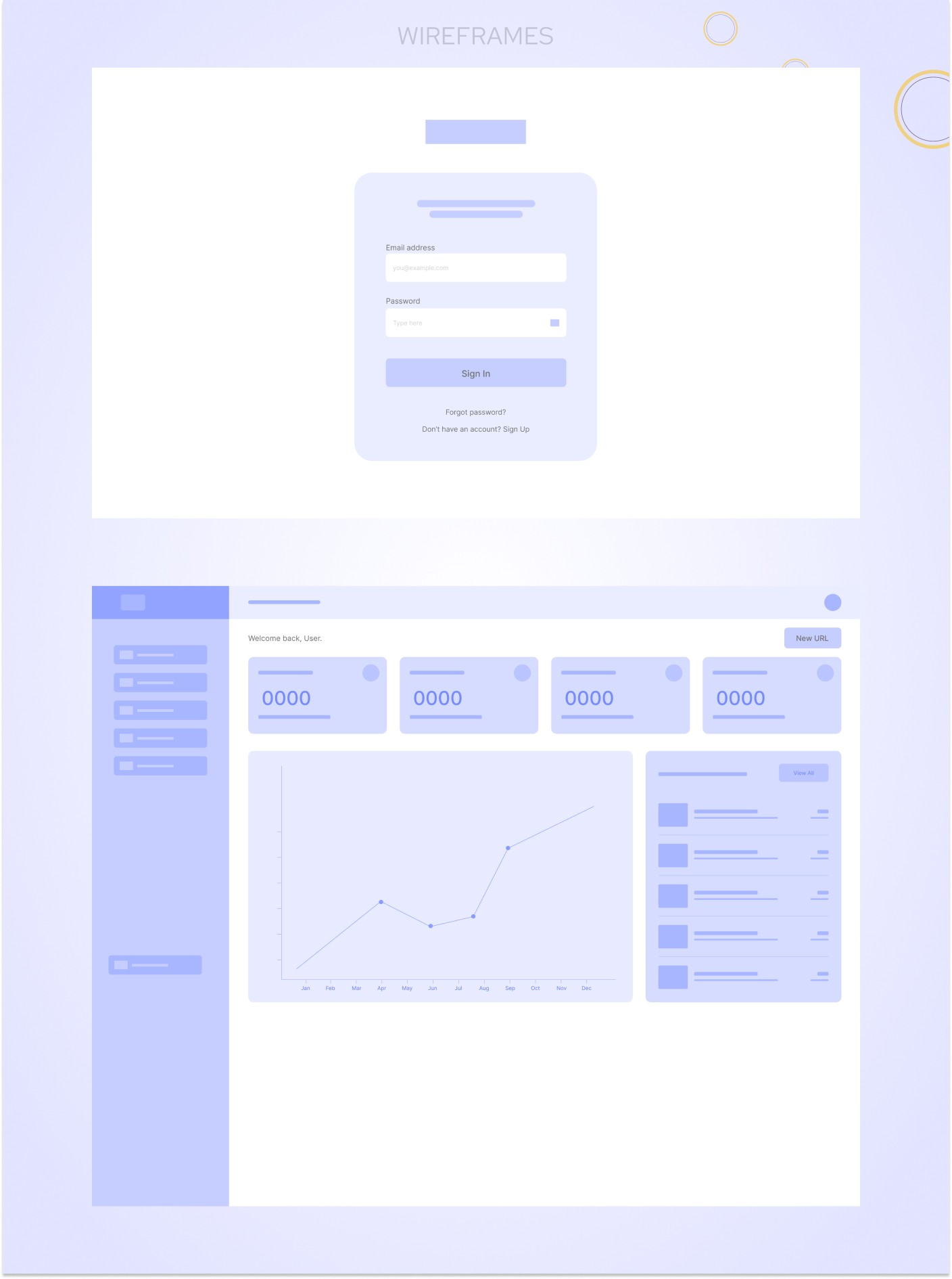
✏️Ideation & Wireframes
We moved quickly from ideas to low-fidelity wireframes, focusing on:
Simple navigation
Quick access to shorten a link
History and link analytics as a central feature
These wireframes evolved into high-fidelity mockups, which helped us test layout and functionality before moving into prototyping.
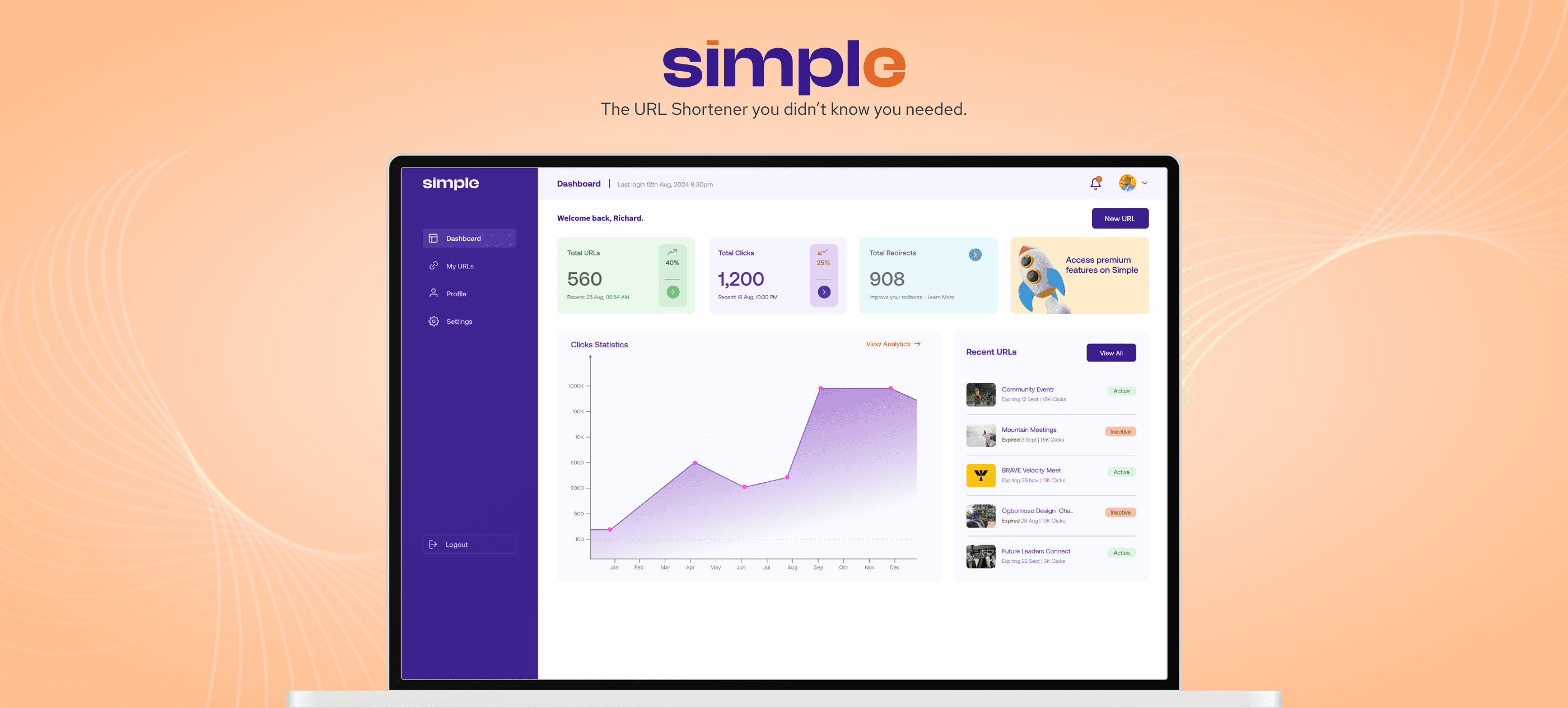
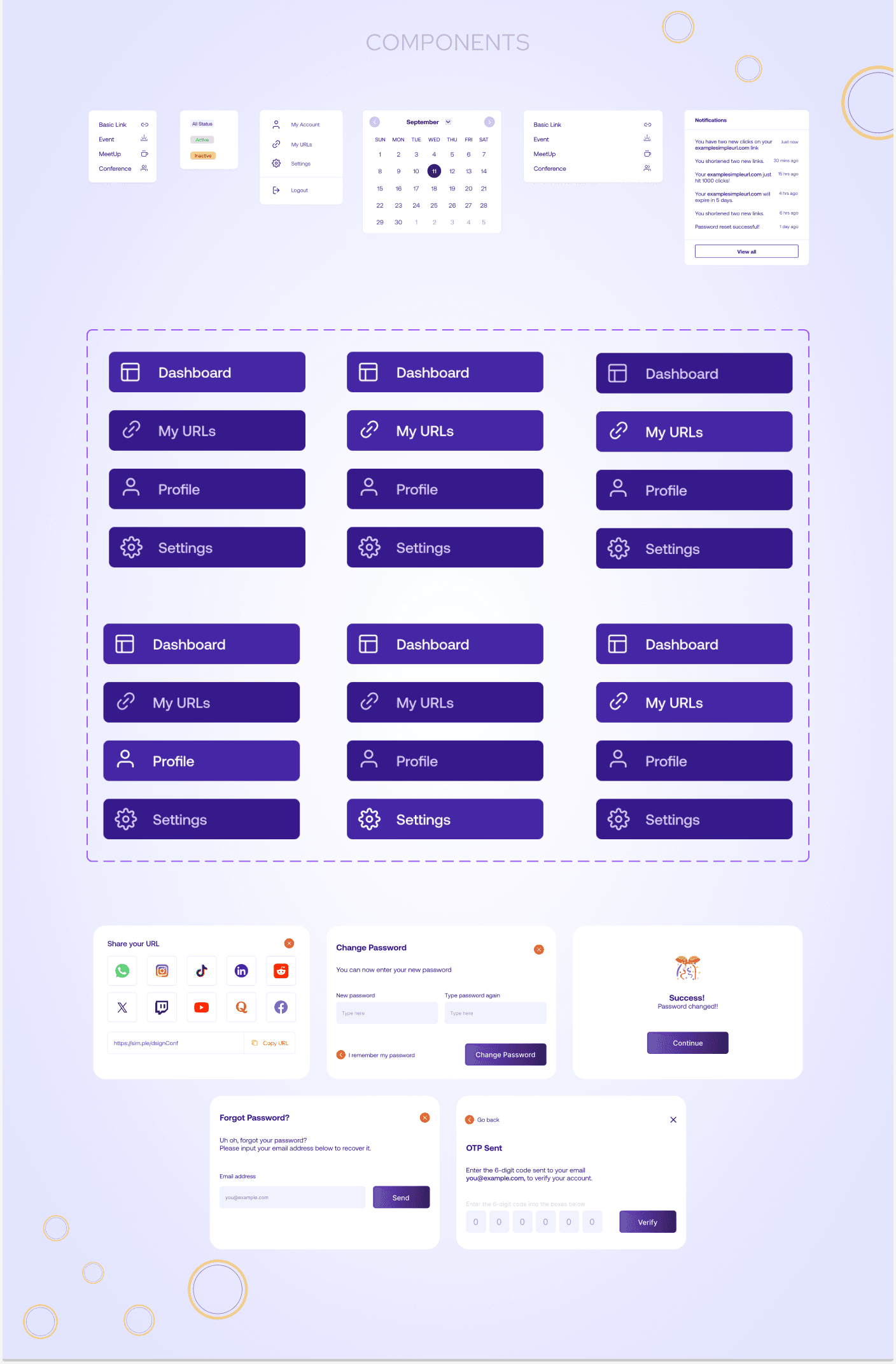
🎨 Visual Design System
Colors: We combined orange and blue — colors from the original brand — to create contrast, energy, and approachability.
Typography & Layout: Clean sans-serif type and generous whitespace made the interface feel breathable and modern.
Affordance & Clarity: We paid attention to micro-interactions, button states, and iconography to ensure users always knew what to do next.
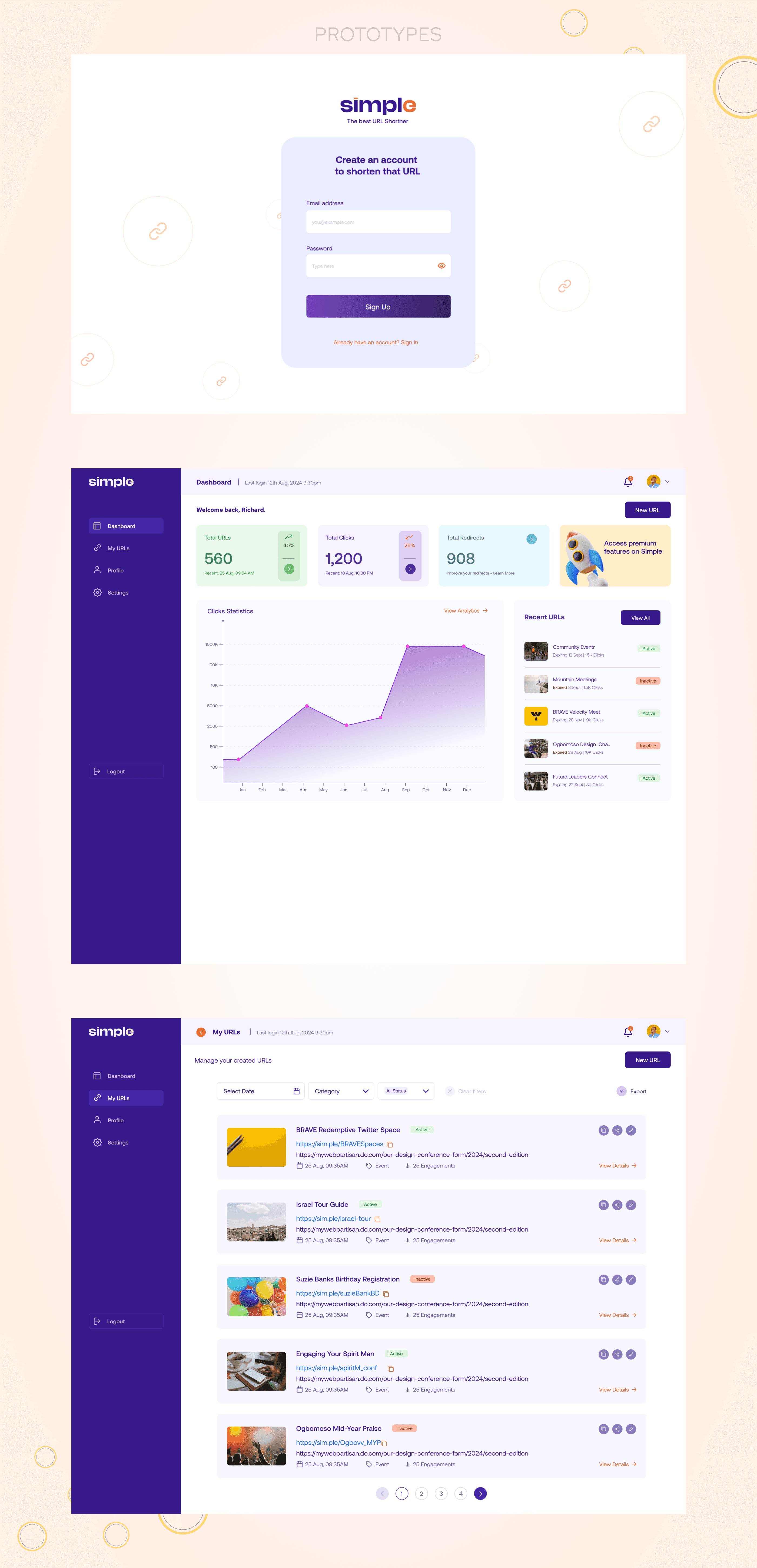
⚙️ Prototype
Interact with the protoype: